- Role
- Copywriter, Head of Design, Principal Designer
- Year
- 2015 to 2016
- Client
- Startup
- Industry
- Delivery, Gig Economy, On-Demand
- Team
- Skills
Runur Mobile Delivery App
Get anything delivered anywhere to anyone
Ready, Set, Go!
Need to get a couch from someone on Facebook Marketplace? Use Runur. Gotta get a leaf blower back to an old neighbor? Yup, just use Runur! Want a sandwitch from your favorite deli? Runur.
When Uber, Lyft, UberEats, DoorDash, and Favor were just breaking out, the mobile landscape was shifting overnight. Runur came up in that same wave, but with a different angle. Not just business-to-consumer, Runur made consumer-to-consumer possible, too.
If you bought a tv on Craigslist, needed something dropped at a friend’s place, or wanted to move an item across town, or documents delivered to someone quickly. No truck borrowing, no favors owed, no hassle.
Runur wasn’t just riding the on-demand wave, it was expanding it. All of the business-to-business abilities the market wanted were there, but so was a way to use that same network for personal needs.
We pushed the model beyond restaurants and retailers into peer-to-peerlogistics, building a delivery network that worked for real life, practical, personal, and built for the way people already lived, making it a little easier.
The Running Man
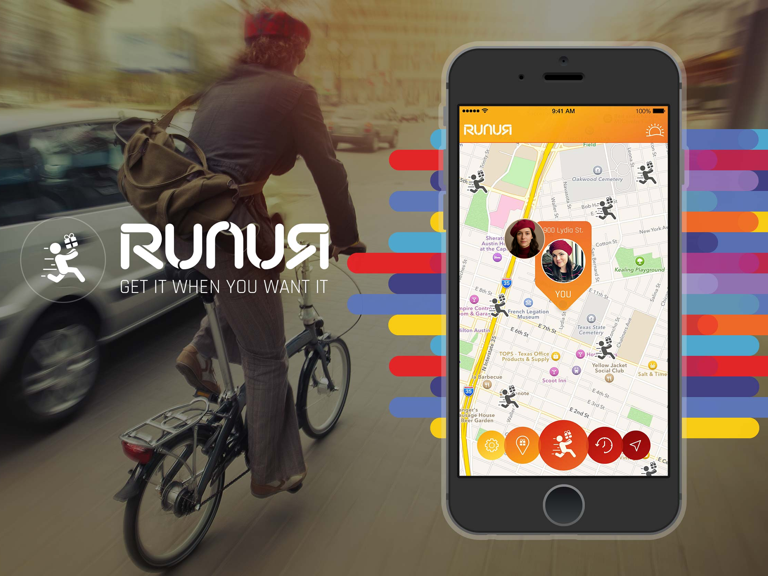
The Runur logo captures movement at its core. The running figure holding a package is set against a bold orange circle, instantly communicating speed, energy, and delivery. The rear-leaning posture and trailing motion lines give the icon a sense of urgency—something is happening now, not later.
The logotype extends that energy. Each letter is built from continuous strokes with rounded edges, flowing into each other like connected paths. The gradient palette, orange into red, then light blue into navy, adds depth and progression, suggesting both diversity and scalability. It’s a visual metaphor for connection across distances.
Together, the icon and wordmark balance playfulness with utility. The design feels approachable while still professional, making it clear this is a service built for real-world logistics but friendly enough for everyday users. It conveys trust and reliability without losing the spark of creativity.
Custom Typeface
After the logo, I wanted headers/titles to all use the same type from the logo. Instead of just drawing out what was needed, I built a custom font that I could install and use whenever/wherever. Each character is built from modular, curved strokes with breaks that give the letters rhythm and motion. The split-line detailing in forms like the “R,” “N,” and “U” reinforces the idea of movement, as if the letters themselves are being delivered in pieces and reassembled.
The alphabet is geometric but not rigid. Rounded terminals soften the look, making the type approachable and consistent with the brand’s personality. At the same time, the angular joins in characters like “K,” “X,” and “Y” introduce a bit of edge, balancing friendliness with a sense of precision.
By designing a custom alphabet, Runur created a system that could extend beyond the logo into marketing, UI, and motion graphics. It wasn’t just a wordmark, it was a visual language. The typeface helped the brand stand apart from competitors by carrying the same energy of speed and delivery into every letterform.
Runur App
I designed a custom icon set to carry Runur’s brand energy into every micro-moment of the product. The icons use our vibrant coral against deep graphite to create instant contrast and a sense of motion, even when static. That same pop you feel in the palette shows up here as clear silhouettes, bold fills, and confident negative space that read fast on any screen.
To keep the set cohesive, I built each glyph with consistent proportions, corner radii, and optical weight, then simplified details so they stay crisp from 16px to banner sizes. The forms are friendly and purposeful: rounded geometry for approachability, solid fills for legibility, and subtle motion cues (sun rays, dotted paths, forward-facing vehicles) to suggest speed and follow-through.
Buyer View
The Runur Buyer View was designed to keep things simple and direct. From the first screen, users were guided through the essentials—who, what, where, and when—making setup feel natural and fast. The goal was to strip away friction so a delivery could be scheduled in under a minute. Each interaction was designed around clarity: big tap targets, linear flows, and confirmation points that reduced second guessing.
Beyond simplicity, Runur introduced features that made the experience feel smarter and more reliable. Options like delivery type, special instructions, and photo or signature confirmation gave users control without slowing them down. The live map view kept people confident their Runur was on the way, while notes and photo uploads made it easy to capture details that could otherwise get lost in handoffs.
A standout feature was night mode, which visually shifted the app’s palette when used after dark. This wasn’t just a skin, but tied directly to pricing, making it clear when demand was lower but availability was tighter, and rates were higher. The interface made that distinction unmistakable, helping set expectations while keeping transparency front and center. It gave Runur a layer of trust and honesty that mattered in an on-demand world.
Runur View
Runur View was designed to give Runurs everything they needed at a glance. Once a job was accepted, the interface shifted into a focused delivery mode: pickup and drop-off details sat front and center, with names, addresses, and package size always visible. Distance and estimated time of arrival updated in real time, so the Runur never had to guess how far they were from their next stop.
The map anchored the experience. Each delivery point was marked with bold, color-coded pins and photos of the sender or recipient when available, making it simple to match names and faces to addresses. Navigation controls were built directly into the flow, so a Runur could track their progress without switching between apps.
To close the loop, Runur View handled confirmations right inside the workflow. Whether it was a requested photo, a drop-off note, or a signature, the system captured proof quickly and logged it against the delivery. That way, both the sender and recipient had confidence in the handoff, and the Runur could move straight to the next job. It was a streamlined dashboard built for speed, clarity, and trust on the road.
Landing Page
The Runur marketing site was designed around a single focal point: the device. As you scrolled, the phone stayed fixed in place, while the story unfolded around it. Content panels, headlines, and color bands animated in, creating a sense of movement without ever pulling attention away from the product itself.
When the narrative needed to emphasize a feature, like setting up a delivery, or tracking a Runur on the map, the phone would zoom in, letting visitors see the app in action at full detail. This interplay between static and motion made the walkthrough feel alive, almost like a guided demo, but without asking the user to click or explore on their own.
It was a simple but powerful design choice: keep the device as the anchor, and let the story animate around it. That way, every visitor left with a clear picture of how Runur worked and why it mattered, all within a single, fluid scroll.