- Role
- Brand Designer, Copyrwriter, Creative Director
- Year
- 2021
- Client
- Agency
- Industry
- Product Building, Product Design, Software Design
- Team
- Skills
Rocksauce v9 Brand & Website
Version 9 of the Rocksauce Studios Brand & Website was the ultimate distillation of the brand.
Distillation
Since founding in 2010, the Rocksauce Brand had gone through a few evolutions. Some long-lived, some extremely short. In 2014, I created the Lightning Drop - a single mark that I felt truly captured the essence of who we were. Like a concentrated drop of amazingness. In 2021, I further refined it to what I feel is its ultimate expression.
My move was from sharp-edges and a thinner outline to making the whole mark have a bigger visual footprint while essentially remaining the same to the casual onlooker. Thus was born 2020's Thunder Drop - the echo of what was carrying forth the resonance into the future.
Use the slider to reveal
Along with the refreshing of the Drop, the wordmark needed updating as well. We had successfully been able to just refer to ourselves at Rocksauce, making things much easier for communication. The 2014 version of the logo was also thin, meaning it wasn't as successful at small resolutions. particularly the "studios" appendage that floated below.
I removed the Drop from the "O," instead having two official placements. One with the drop just about to hit the uppercase "R," to illustrate the moment of inspiration that was about to occur. The second was a more rare usage, but great for stickers, shirts, and other places where we wanted to let the Thunder Drop shine, but places the now much bolder Rocksauce below.
The font was a custom variant of Helvetica Neue, which would be used as the corporate font going forward. All of the edges were slightly rounded, with a custom "k" that featured the same disconnected arms that was from the 2014 logo. The end result was much bolder, stronger, modern, and usable in many more applications.
Culture
Rocksauce is bold. Unafraid. Vibrant. I chose colors that made this obvious. Every evolution of Rocksauce brings new life to the color family. Brand growth doesn’t stop at new logos or typefaces. Old faithfuls get retired + whippersnappers splash onto the screen.
The objective of the Rocksauce Visual Language was showcasing work + content. Many colors were avaialble, but never to be used all at once. We had to resist the urge to bury the lede with too many colors or over-design.
Main Hues
- Tri-Color: Background, text + accent
- Use color to motivate + inspire action
- Solid, simple + clean wins the day
- Avoid drunken unicorn rainbow puke
- Abstain from distracting gradients
- Butting colors next to each other looks gross
Additional Hues
Rocksauce Culture + Brand Manual
To ensure that our team was on the same page, I created the Rocksauce Culture + Brand Manual. More than just a style-guide, this Manual served as a way for Rocksaucers to speak to others, create marketing or branded assets that resonated with one voice. The Manual also did a great job of introducing new clients to who Rocksauce was, how we thought of ourselves, and what our core values were.
Rocksauce had always been a little edgy and in your face. Clients had often cited our humor and boldness as a reason they chose us over the competition, but not everyone understood how to express it the right way. It was a very fine-line between crude and cheeky. To help, I built added in a set of guidelines that not only covered high-level concepts like tone, but specifically listed out a Wordbank of phrases we used and when. Since not all customers or venues are the same, I also created a specific guide on the Tone of our voice and how where what ranges applied to particular types of clients.
Brand elements are a lot more than just the fonts, colors and vocabulary. Consistent, recognizable layout and imagery was also a big piece of the Rocksauce v9 refresh. We trusted our team to create videos, assets, and brand elements as they saw fit, because everyone working together shows their passion for the company. But, I couldn't have a bunch of different designers coming up with their own design concepts. That's no way to build brand recognition.
The Manual showcased specific layout templates (also available in Figma) for how a One-Sheeter,Social media post,Ad, bio-spotlight, video covers, and even Figma thumbnails should be arrange. Imagery was to be bold, contrasting and interesting enough to stop people mid-scroll and pay attention. Messaging should be simple, bold and to the point.
Website v9
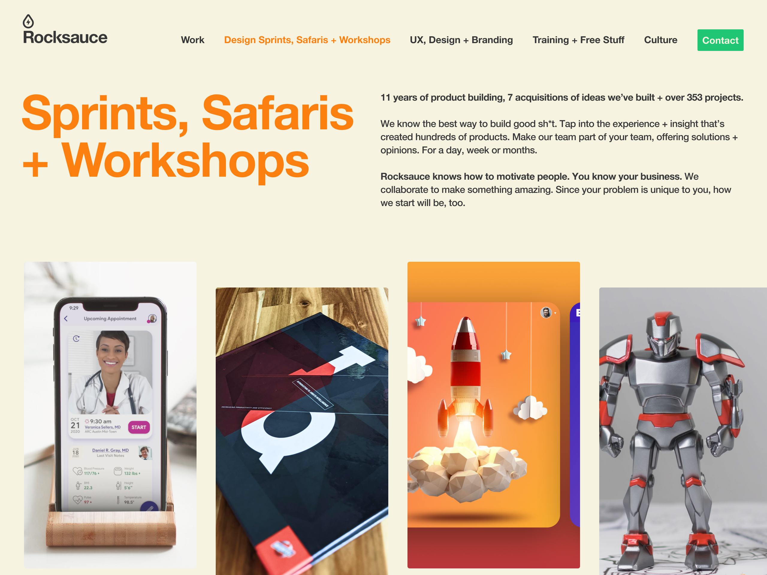
Now with our brand redefined, it was time to tackle the Rocksauce website. From our analytics and user tests, many of the elements we had included on the previous Rocksauce v8 version were no longer attracting clicks by this point. While initially showing promise, as the world moved forward, they weren't as viable as they once were. I set about cleaning up and streamlining the homepage content and focusing the top navigation on the elements we wanted to push people to.
We knew we wanted folks to see our Work. Sales wanted people to contract new Design Sprints, Safaris + Workshops, so we needed to highlight those and explain them. Then I wanted to specifically call out our core disciplines that people came to us for - UX, Design + Branding. Additionally, as I was working on the EXSquared Rebrand at the same time, you can start to see elements like the large number grid shared across both Rocksauce and our parent company.
Use the reveal slider to see a side-by-side comparison between RSv9 and RSv8 homepages.