- Role
- Copywriter, Creative Director, Development
- Year
- 2016
- Client
- Agency
- Industry
- Client Services, Product Building
- Team
- Skills
Rocksauce v8 Website Narrative
Explaining how Rocksauce works through visual storytelling.
Conundrum
At Rocksauce, we had moved from being a company that built apps or websites into a product design agency. Our success in the app space, lead to full-blown website overhauls, which then lead to Enterprise companies like Bechtel and ConnocoPhillips bringing us in to tackle extremely complex issues with AI, procurement, field-management, data-analysis, hearts & mind campaigns and more. We loved the work, we excelled at it and we wanted more!
Niche marketing to a smaller space like apps is much easier to wrap your head around than, "Yeah, we do that, too!" Most of our examples were in the app or website zone, which meant we were constantly. hearing, "But, all I'm seeing on your site are apps?" Working in Enterprise was lucrative & exciting, but the proprietary nature of said work means not being able to broadcast it to the world. On the other side, when I tried listing out the specific industries we had done solutions for and what they were, we ran into the problem of, "Okay, but I don't see my industry listed. Can you handle X, Y or Z?"
"Maybe," I thought, "if we can tell a big, bold story about us solving a huge issue, that's more metaphorical than real-world, it will help people make the connection!" That's when the astronaut narrative was born.
Tell a Big Story
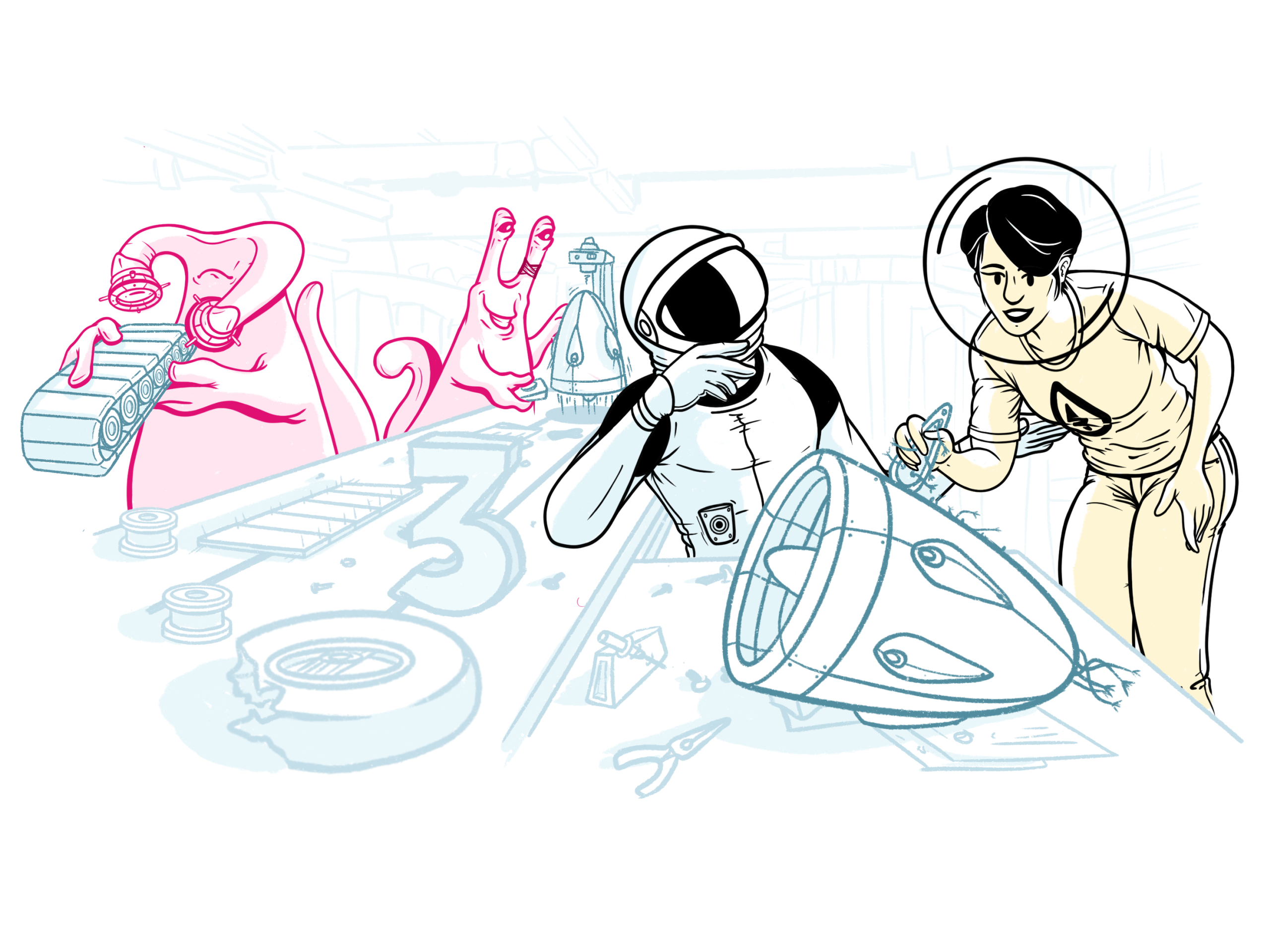
Our narrative was simple: an astronaut is exploring a distant planet when suddenly he finds his rover stuck in a massive crater. Even worse, a ginormous pink alien is angry, yelling & screaming in a language the astronaut can't understand! Luckily, Rocksauce is on the case to help serve as a bridge so all interested parties get what they need.
Next step was to start illustrating the story, so I pulled out my trusty iPad, opened procreate and started sketching out concepts of what our astronaut, aliens, and various scenarios could be.
The Site
The final design for the Rocksauce site was all about making narrative and design work together without sacrificing clarity. The astronaut story was the metaphor, but the site design had to carry it seamlessly. That meant building a structure that could move between bold illustrations and clean business content without feeling like two different sites.
The flow starts traditionally: a big, confident hero with a clear statement and CTAs, backed by trusted client logos. That instantly grounds us in credibility. From there, the design intentionally shifts gears — case studies, process, content — each section gets its own visual treatment, but the grid and typography keep everything consistent. It feels playful, but it never loses its professional polish.
We wove the illustrations into the grid like they were part of the content itself. Instead of floating randomly, the astronaut and alien visuals act as visual dividers between process steps. They give the story breathing room while also guiding the scroll. The user never feels yanked out of the site; the visuals feel integrated, like chapter markers in a book.
The rest of the design is ruthlessly functional. Big modular cards for case studies and blog posts make the site scannable. A bold “5 Tips” lead magnet sits mid-page as a natural CTA instead of a tacked-on ad. Even the footer carries weight, turning downtime space into a live counter of wasted dollars, reinforcing urgency while keeping people engaged. Every element earns its place.
One of the things I’m happiest with is how the tone of the design mirrored the Rocksauce brand. The illustrations add personality, but the typography, spacing, and consistent CTAs remind visitors we’re here to do serious work.
It’s approachable without ever feeling silly. You get the sense we’re fun to work with and capable of tackling enterprise-scale problems.
In the end, the design is what made the narrative click. The astronaut story is fun, but it’s the structure — the flow, the visuals, the modular system — that makes it usable, credible, and easy to explore.
Visitors leave with a sense of who Rocksauce is, what we do, and why we’re different, all without feeling like they were just sold to. That balance was the goal, and the final site nails it.