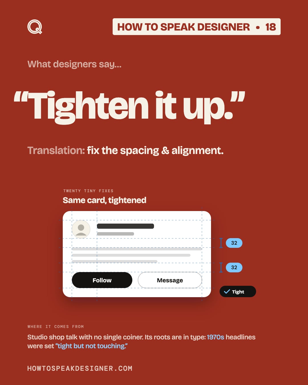
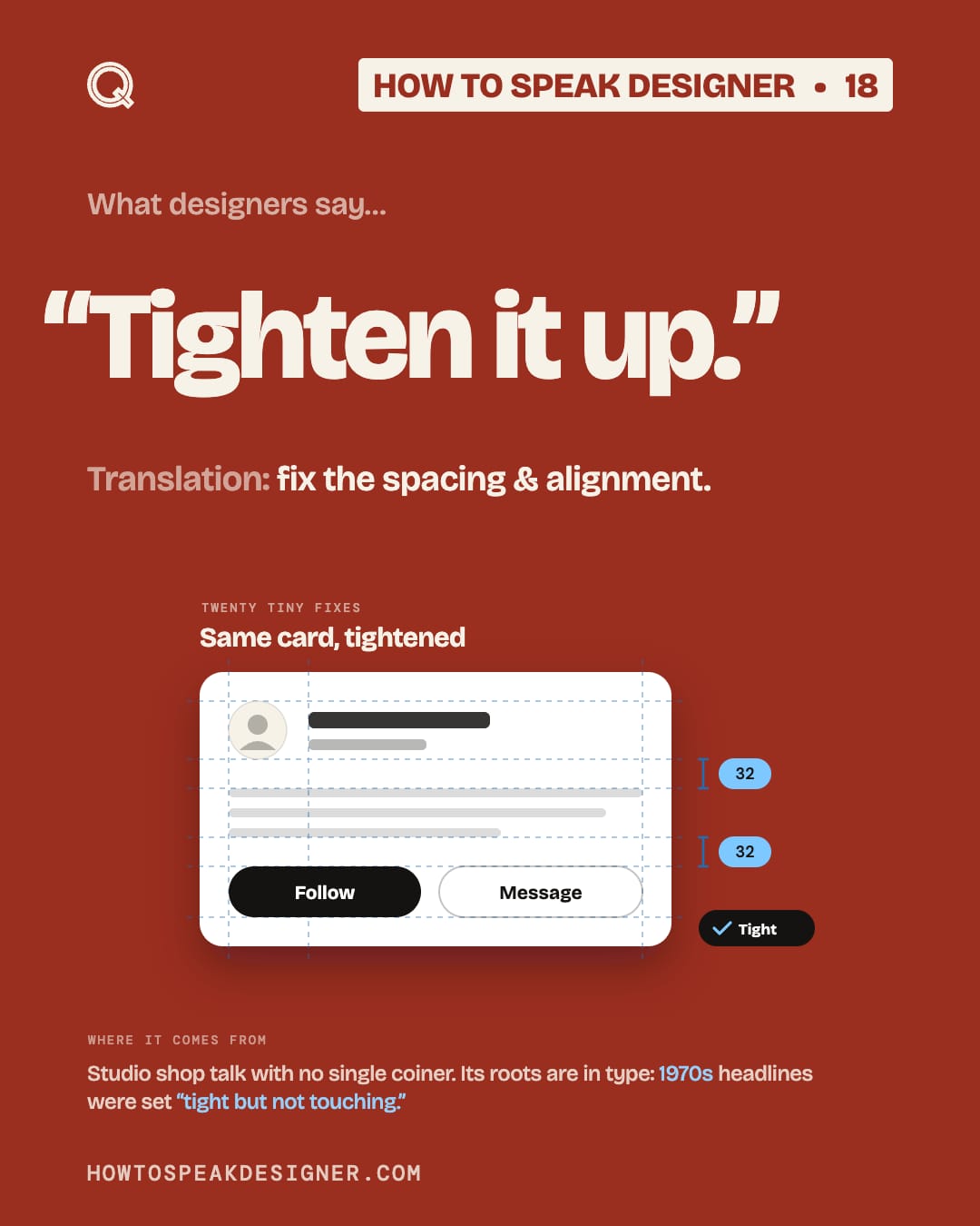
No. 18 “Tighten it up.”
Translation
fix the spacing & alignment.
It’s rarely one big change. It’s twenty tiny ones: even gaps, shared edges, things that line up.
You feel it more than see it.
Try this
Pick one spacing number. Use it everywhere.
Where it comes from
Nobody invented it. It’s studio shop talk.
But tight has deep roots in type. In the 1960s & 70s, designers like Herb Lubalin set headlines “tight but not touching,” or TNT.
Now it means all the spacing, not just letters.
- Google Fonts Knowledge, “The ‘tight not touching’ style”
- Paul Shaw, “Tight but not touching kerning” (2011)
Save this
Save this for the next time a design feels “off” & you can’t say why.
Every format
Carousel slides