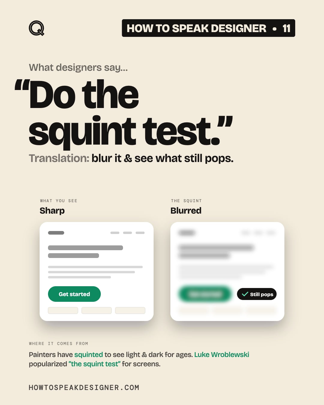
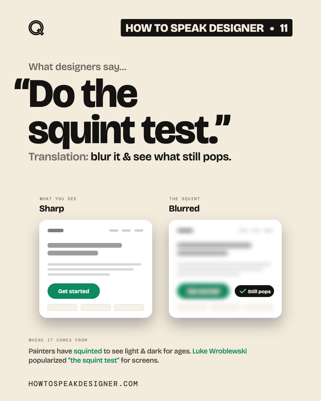
No. 11 “Do the squint test.”
Translation
blur it & see what still pops.
Squint until the words go fuzzy. Whatever still stands out is what people notice first.
If that isn’t the most important thing on the screen, the hierarchy is off.
Try this
Squint. Does the main button still win?
Where it comes from
Painters have long squinted at their subjects. The detail fades & only the big shapes of light & dark remain.
UX designer Luke Wroblewski brought the habit to screens & calls it “the squint test.”
Nobody owns the squint. He just gave it a name.
- Luke Wroblewski, “Evaluating User Interfaces with the Squint Test,” LukeW (2023)
- Nielsen Norman Group, “Squint Test” (video)
Save this
Save this for the next time you can’t tell what matters most on a page.
Every format
Carousel slides