No. 25 Aesthetic-Usability Effect
Translation
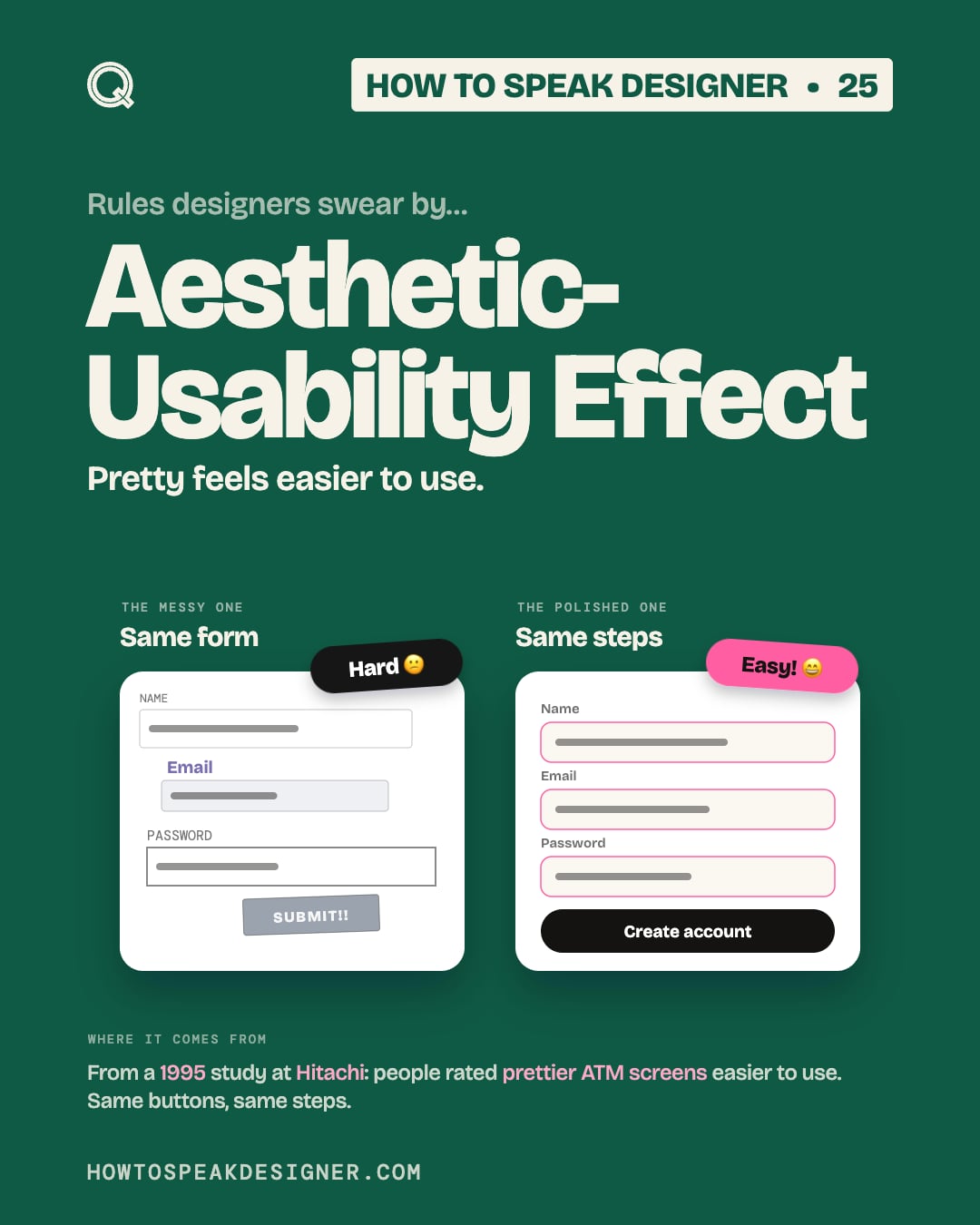
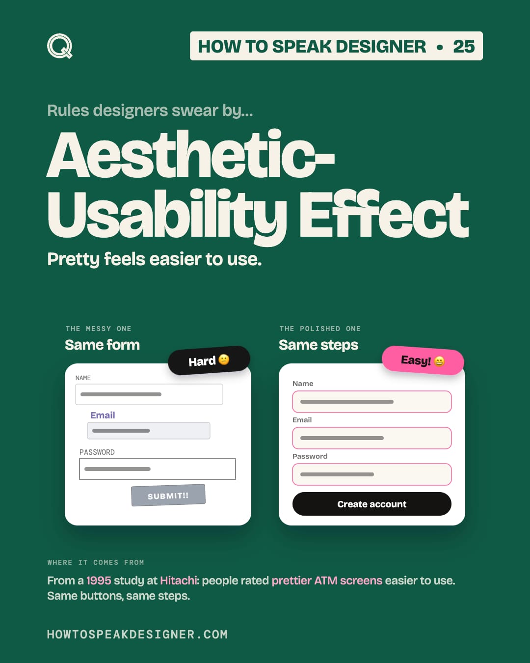
Pretty feels easier to use.
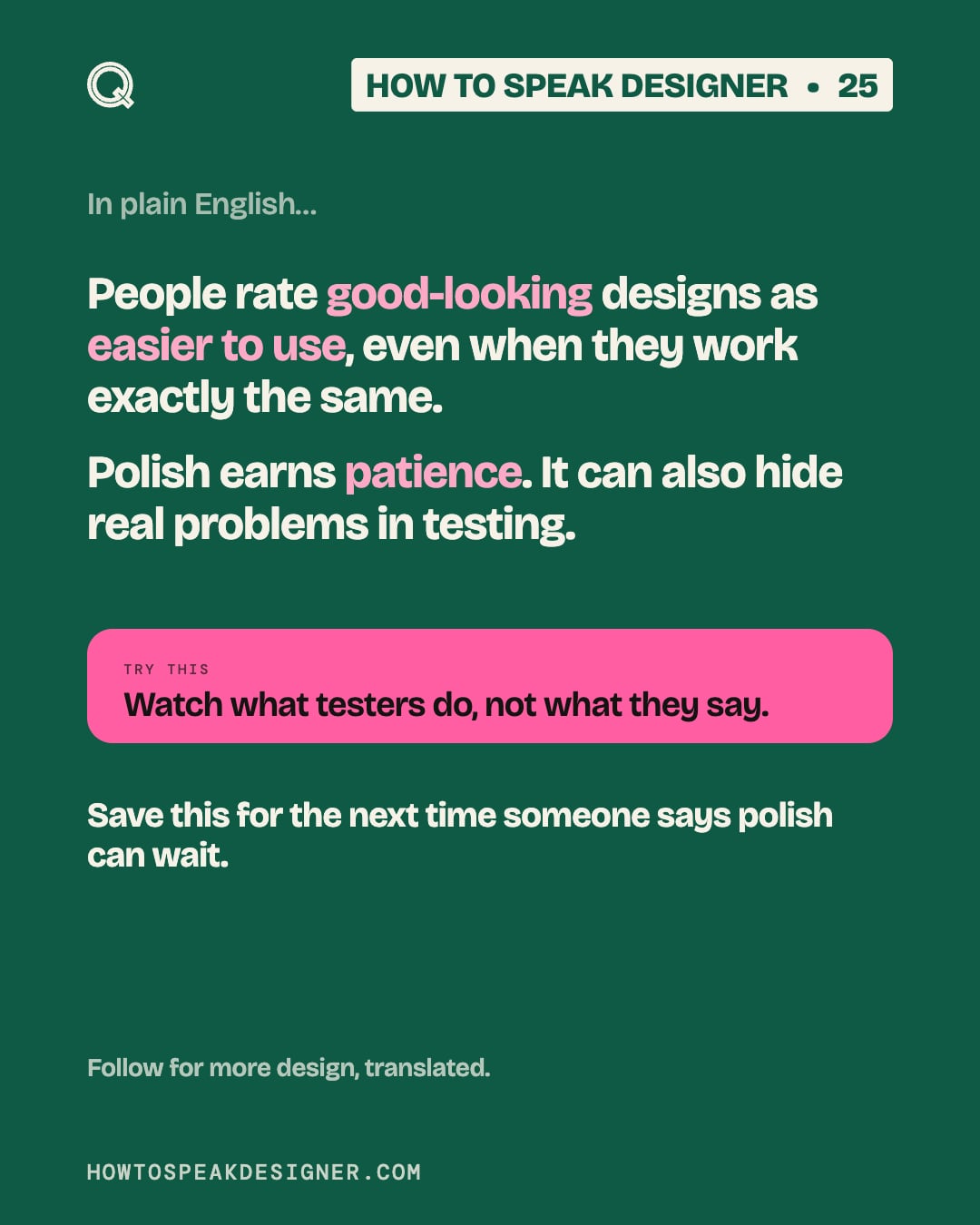
People rate good-looking designs as easier to use, even when they work exactly the same.
Polish earns patience. It can also hide real problems in testing.
Try this
Watch what testers do, not what they say.
Where it comes from
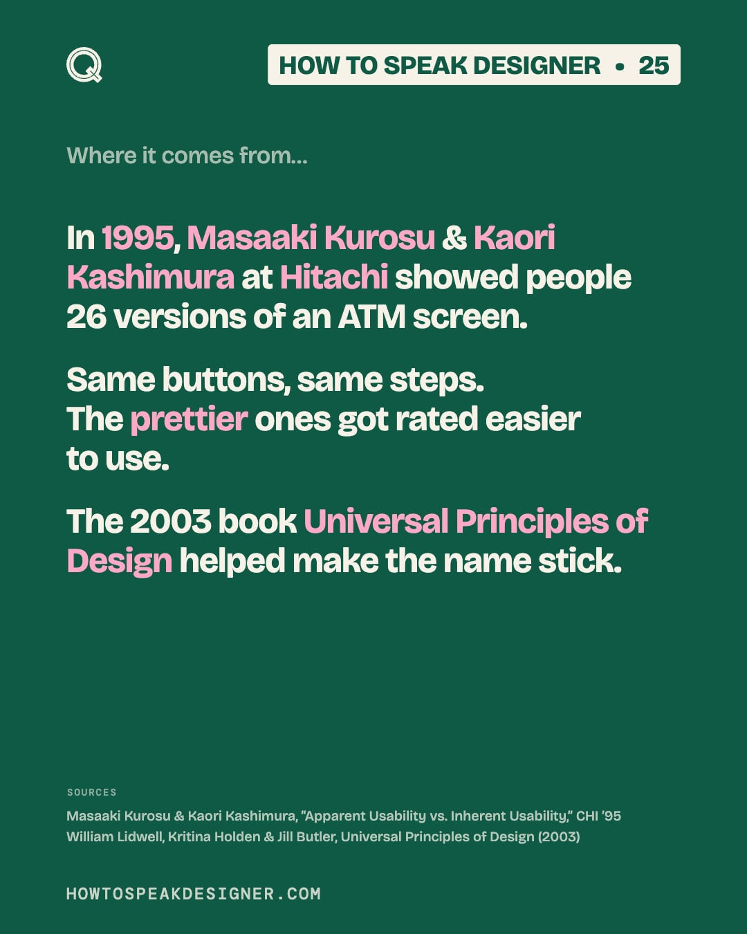
In 1995, Masaaki Kurosu & Kaori Kashimura at Hitachi showed people 26 versions of an ATM screen.
Same buttons, same steps. The prettier ones got rated easier to use.
The 2003 book Universal Principles of Design helped make the name stick.
- Masaaki Kurosu & Kaori Kashimura, “Apparent Usability vs. Inherent Usability,” CHI ’95
- William Lidwell, Kritina Holden & Jill Butler, Universal Principles of Design (2003)
Save this
Save this for the next time someone says polish can wait.
Every format
Carousel slides