- Role
- Account Executive, CEO, Creative Director
- Year
- 2019 to 2020
- Client
- Home Sales, Saas, Startup
- Industry
- New Homes, Real Estate
- Team
- Skills
Reimagine Selling
A values-based sales tool for new-home sales associates: a guided buyer assessment, a Value Map, scored properties and a side-by-side decision view
Overview
Reimagine Selling is a sales tool built around one idea: a salesperson sells better when the buyer has first spelled out what value means in their daily life. The client already had a working web product and a method he had established himself. In 2020 my team at Rocksauce Studios reviewed the market, reworked the UX of every screen, designed a new tablet-first UI and design system, and then designed the marketing site that explains the process. Provenance is clear-cut: the analysis deck and the UX wireframes carry Rocksauce branding, and every date in the files falls between February 2020 and May 2021, before the EX Squared rebrand.
Problem
The client's product did its one job, but it looked and behaved like internal software. Our brief, as we wrote it at the time: "UX should make the software and process more streamlined and attuned to audience expectations. This will allow the client to focus more on the philosophies he's established and less on direct software training," and UI should put the product "shoulder to shoulder with its peers." He also wanted room to grow beyond new-construction home sales, so we were told not to limit the review to real-estate tools.
The users are sales associates, and the designs have the salesperson filling out the assessment on a buyer's behalf, on web or tablet. So every screen had two readers: a salesperson who needs the next action, and a buyer who needs plain questions that are "easier to read for customers."
Solution
Industry design analysis. A UX designer on my team reviewed the tools salespeople use every day: Salesforce, Evernote (singled out by our own sales team) and Keap. The conclusion was deliberately modest: "This is not a reinvention of tested tool, but a realignment of design expectations," organised around four words: guided, intuitive, organized, useful. The Salesforce takeaway shaped the dashboard: put what a salesperson needs "right in front of them on a dashboard."
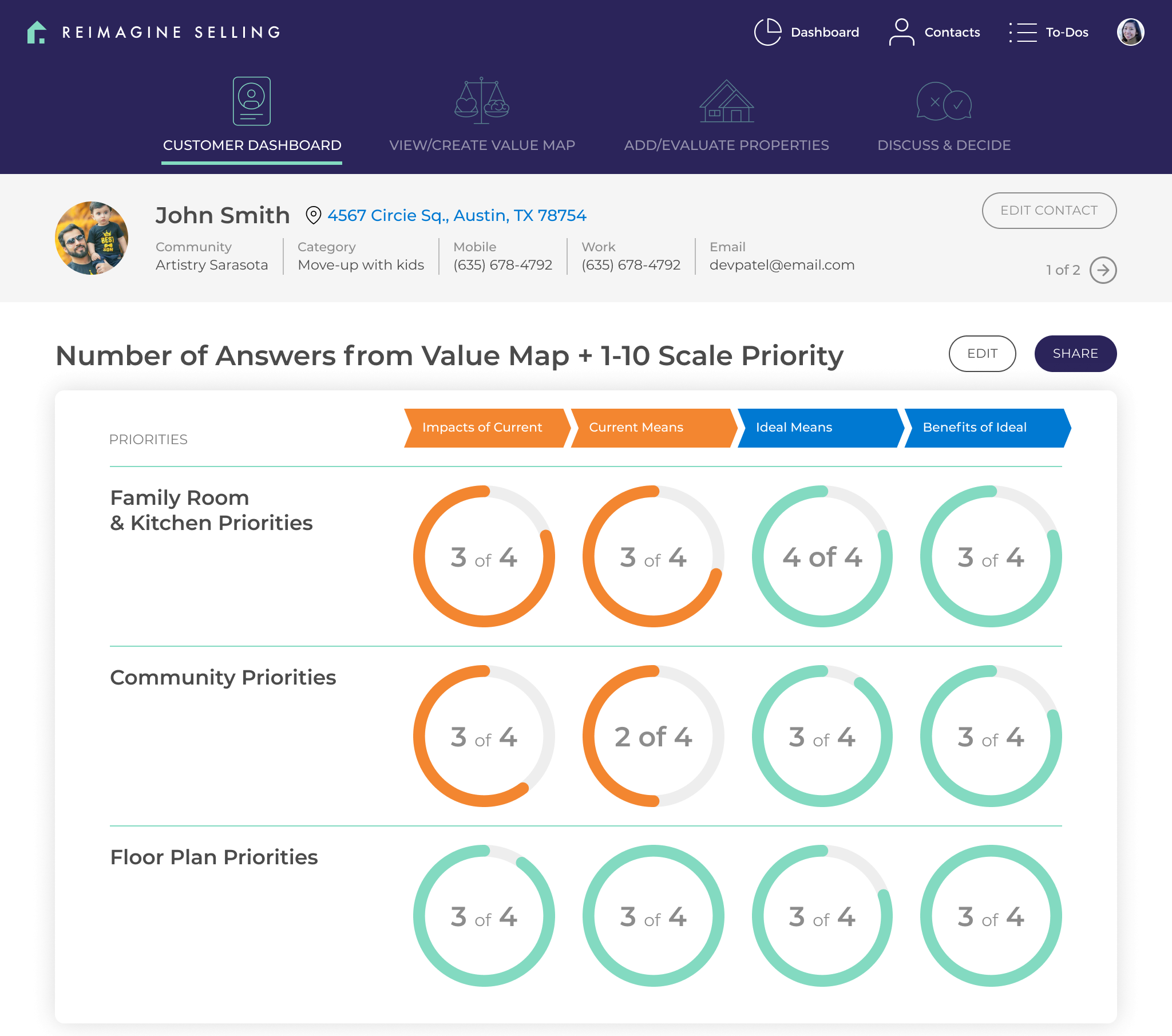
UX rework, screen by screen. We captured the existing product on February 28, 2020 and paired each original screen with a Rocksauce wireframe and a short list of changes. The buyer's contact record became four tabs that follow the method: Contact Overview, Create/View Value Map, Add/Evaluate Properties, Discuss & Decide.
The assessment changed most. We replaced a popup with a full screen "since this part is required," swapped a control that "looked like a slider but didn't function as such" for one-choice radio buttons, and added a progress bar, recall of previous choices "as large callouts," and Previous and Next buttons that stay inactive until the step is ready. The notes say the design was "intended for possible touch-screen kiosk." For the happy or unhappy fork, we offered "the binary choice first" and then revealed only the answers that relate to it.
Product UI. The UI pages are marked complete for Dashboard, To-Dos, Assessment, Contacts & Value Map, and Profile & Settings, all drawn at 1024 wide, a landscape tablet. The dashboard kept the wireframe's drag-and-drop modules and sortable to-dos.
The assessment opens by asking the buyer to choose three of eight priorities, then walks each priority through ideal features, benefits, current frustrations and a 1 to 10 confidence rating.
Each property the salesperson adds is then rated against that Value Map and given a Perceived Value Score, and Discuss & Decide puts three homes side by side, criterion by criterion.
Profile & Settings includes custom branding in the header and an alternate colour scheme, which came from a UX note: a "white labeled" top bar "w/o losing Reimagine Selling brand."
Design system. A separate library file holds the atoms (inputs, dropdowns, buttons, tabs, sliders, icons, colours) and the larger Value Map, contact, properties, discuss and value-score components.
Architecture shaping. A developer on my team used the designs to write a technical shaping document: a progressive web app on a serverless back end, plus a list of blockers where the designs had gaps, such as authentication, team management and what a home buyer sees on their own. That list is the most honest record of where the design stopped.
Marketing site. We wireframed the homepage in June 2020 and took the UI through dated revision rounds from September 25, 2020 to February 22, 2021, including a round that removed auto-scrolling sections in favour of a conventional page. The site sells the three-step process using the product's own screens. Its sales statistics and testimonials are the client's marketing claims, not results I measured, so I leave them out.
Outcome
The design work covered the whole product: analysis, UX, UI, a component library, a build plan and a marketing site. I have no sourced evidence of launch, usage or sales impact. A "New Logo" page and a "ValueMap Story" walkthrough also sit in the UI file; I left both off because authorship of the logo is not evident, and the story screens carry the client's real contact details.