- Role
- Creative Director, Design Direction, Head of Product
- Year
- 2021
- Client
- Saas, Startup
- Industry
- Consumer, Customer Loyalty, Education, Fundraising, Non-profit
- Team
- Skills
Givebacks + MemberHub
A cashback-for-causes product for school PTAs and nonprofits, taken from design sprint to web app, browser extension and a cause admin portal
Overview
MemberHub makes software that PTAs and other nonprofits use to communicate and raise money, and Givebacks is its cashback product: families shop, merchants pay cashback, and a share goes to the school or cause the shopper picked. My team at Rocksauce ran three back-to-back sprints on Givebacks in February and March 2021, tested two prototypes with eleven parents and PTA volunteers, then redesigned the product for the web when the technology under it changed that autumn. The work grew to cover a Cause Admin portal for the organisations receiving the money and, in February 2022, a UX review of MemberHub's own admin. I led design on this and it shipped. Every deck and file cover in the archive is Rocksauce branded and no file mentions EX Squared, but some pages carry mid-2022 dates and are left off this page.
Problem
The two-year goal the sprint team wrote on day one was for Givebacks to be "on the homescreen/bookmarks of every parent and every philanthropist as the main place they use to shop". Against that, the three sprint questions were blunt: can we get a consumer to sign up, can we become part of their commerce routine, and can we get people to believe that changing where they shop makes a difference.
The user problem was comprehension. A cashback product already asks people to trust it with a card; this one also had to explain two flows of money at once. In the first test, people "were unsure which dollar amount went to the school, which went back in their pocket", and were not confident about givebacks versus voucher versus gift card versus cashback. No sourced material gives a revenue, sign-up or donation target.
Users & research
The testers were the people a PTA would actually send a link to: a PTO treasurer and board member, a parent involved in PTA fundraising, a parent who runs school auctions, a volunteer, a busy parent who shares fundraisers when she can. Each session opened with "You've just received this link from your fellow PTA member" at a sample school. School and merchant names in the prototypes are placeholder content.
Design Sprint Alpha, 22 to 26 February 2021, 5 testers. Two workshop days in Miro produced the goal, the sprint questions, a journey map, lightning demos and a six-step flow from onboarding to purchase to inviting friends, which we prototyped as a mobile app. The headline was motive: 4 of 5 testers said giving to the school would drive their download more than the cashback, 5 of 5 would keep using it, and 4 of 4 would share their cause. One put it plainly: "The givebacks to the school is what inspires me most to want the app."
The friction was just as clear. None of the 5 had heard of the card-linking provider, although 4 of 5 still felt the interaction was secure, and understanding of card-linked offers was poor: some thought they would have to show a code at the till.
Iteration sprint, 11 to 17 March 2021, 6 testers. We extended the flow from six steps to ten and tested again. 4 of 6 would add their card, mostly because the school referral gave it legitimacy, and 6 of 6 said they would come back after a first purchase. Across both rounds: 7 of 10 wanted to create an account before browsing, 10 of 10 could see themselves sharing the cause, and 11 of 11 would use the app again.
Approach & trade-offs
We killed the Leaderboard. We had added points and a contributor leaderboard to drive sharing. 0 of 6 testers found it valuable, and the consensus was that it "took away from the joy of giving". One tester said the message should be "let's work together rather than let's be #1." In the third sprint the whole concept was retired. The lesson for this audience: giving was the motive, and competition cheapened it.
We traded a clever slider for two plain buttons. The wallet let people split cashback between themselves and their cause with a slider. 5 of 6 understood it, but for several it took talking it through. We removed it and broke the actions into Donate and Transfer.
We scoped with user stories before drawing more screens. The third sprint (23 to 26 March 2021) mapped every feature as a user story, marked how well defined it was, and had the group sticker each one MVP, Future, Nah or Blocked. Development discovery had already changed the design: browse split into gift cards and vouchers on one side and card-linked cashback, served through a third-party SDK, on the other, with a dashboard in front of both. Onboarding was cut to three messages, and because 2 testers only understood why a card was needed after they had added one, we planned to move that explanation earlier.
Then the platform changed and we started the UX again. In September 2021 the client added a cashback network that works through a browser extension, and the engagement moved from a native mobile app to a web solution plus a solution for causes. I would rather say that plainly than pretend the mobile work carried straight over: our own proposal said a web solution "fundimentally changes the user experience we've been designing to date", and recommended a fresh iteration sprint to get one look, feel and feature set across screens. The second UX file is titled "Pivoting the Product".
We ran a responsive website workshop in FigJam, starting from a journey map we had prepared and adjusted with customer feedback. Its "Can we" questions show what worried the room: completing onboarding across two platforms, explaining why extra pieces had to be downloaded, and giving value to people who would not download them.
Solution
Consumer web app. The second round of UX and UI covers the website and app, offers by category, search, cause search and selection, wallet, cross-platform onboarding and its own design system pages. Cause categories had been widened to ten, based on how charity databases classify causes, so the product was no longer only about schools.
Browser extension. The extension journey has the product appear when a shopper reaches a partner retailer and again at the cart, showing in cash what the purchase will give. We marked steps that needed development verification, and the UX notes are candid that the cashback network's data was close to a bare minimum for a good dashboard.
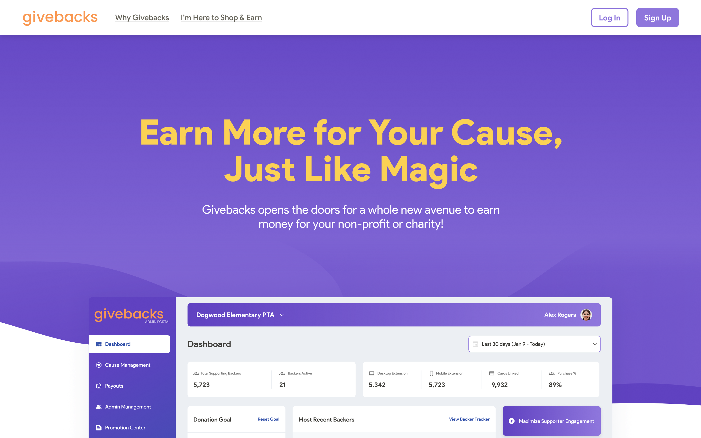
Cause Admin. For the organisations, we designed a portal with a landing page, sign-in, dashboard, cause management, payouts, admin management, a promotion center, a backer tracker and settings, delivered as UI with developer notes. A cause already on MemberHub has its information carried over, and the promotion center leans on MemberHub's own communication tools to spread the link. "Dogwood Elementary PTA" and every name and figure in these screens are placeholder content.
Design system and architecture. A standalone design system file holds colors, typography, icons, core components and a component library, and our technical architect diagrammed wallet, referral attribution and cashback-offer options for the client's developers.
MemberHub admin review. In February 2022 we reviewed MemberHub's admin section by section, giving each a low, medium or high effort option. The review used the client's product analytics: sending messages was the number one interaction, yet Communications was labelled like a messaging center it only partly was. It also called out that back "doesn't go BACK", and recommended testing before changing how users are sent to fundraising partners. The client's own priorities said the app "can feel very overwhelming, particularly to a new user". An Admin Portal Redesign file followed; its UI page is dated 17/06, which I read as June 2022, so it is not shown here.
Results
It shipped. What the archive can prove is the research result: across two rounds, 11 of 11 testers said they would use the product again and 10 of 10 would share their cause, and the two features that tested worst, the Leaderboard and the split slider, were removed before visual design was finalised. The sprint plan also delivered what it promised for handoff: a high-fidelity tap-through, systemised components, a tech architecture definition and user-story scoping.
What I'd do differently
We designed a native app from February 2021 and the direction changed that September, before the underlying cashback technology had been settled, and the change cost real hours. I would push to lock the integration partner, and what its data can and cannot show, before the first sprint, and I would have tested the extension and cross-platform onboarding with users the way we tested the app. The archive holds no test report for the web and extension round.