- Role
- Creative Director, Design Direction, Head of Product
- Year
- 2017 to 2018
- Client
- Enterprise
- Industry
- Consumer, FinTech
- Team
- Skills
First PREMIER Bankcard
A native iOS and Android app for credit card holders: sign in with two-step verification, see a balance, pay a bill, reach a person
Overview
First PREMIER Bank and PREMIER Bankcard issue credit cards, and their cardholders managed those cards through a website that had been squeezed onto a phone. In September 2017 my team at Rocksauce proposed replacing it with native iOS and Android apps, and over the next year we designed them: a competitive review, a tap-through wireframe of 85 screens, a mood board, hero screens, then 137 finished iOS screens and 133 for Android, with icons, slices and fonts handed to our developers. The app shipped. This was Rocksauce Studios' own work, done before the agency was acquired.
Problem
The bank already had a mobile presence. It was the cardholder website in a wrapper: a green header, a Username and Password form, a four-step Enroll that opened by asking for an account number and a Social Security number, and statement preferences buried under three pages of consent text. Everything a cardholder could do was defined by the bank's own functional design documents for the website, 35 of them, from Login Page and Payment to Dispute Transaction and Charged Off Accounts.
So the job was not to invent features. It was to take a regulated, fully specified web product and make it feel like it belonged on a phone, without losing a single required disclosure.
Users & research
We started with what cardholders already had on their phones. Seven card and banking apps were split among my team, and I reviewed Citi and Simple myself. The written analysis, dated October 4, 2017, compared each app on navigation, sign-in and profile, transaction history, customer service and extras, and asked one question of all of them: "Can I easily do what I need to do?"
Two findings shaped the design. Every app covered the same minimum, viewing transactions and paying the card, and every one kept help a single touch away. And they all looked alike: a lot of blue and white. Our analysis argued that First PREMIER's green and white could at least stand apart in the app stores. We did no interviews or usability tests with cardholders that I can find in the archive.
Approach & trade-offs
Wireframe the whole bank, then design it. The UX file is a tap-through of 85 numbered artboards grouped as Menu, Account, Help, Services, Special Offers, About Us, Profile and Products, with branch notes for the demo, such as one path for a user who already has a bank account linked and one for a user who does not. Numbering every screen (Account 01.03.01 Bill Pay, Menu 00.03.01 2Step2) meant the wireframe, the artwork and the developer exports all used the same names.
Green first, then slate. The November 2017 mood board set Raleway beside the brand's Times New Roman and extended the brand palette with shades, including two blue-greys. The December hero screens followed our own advice and went green: a green header, a rendered green card, dark tiles for choosing a payment date and amount.
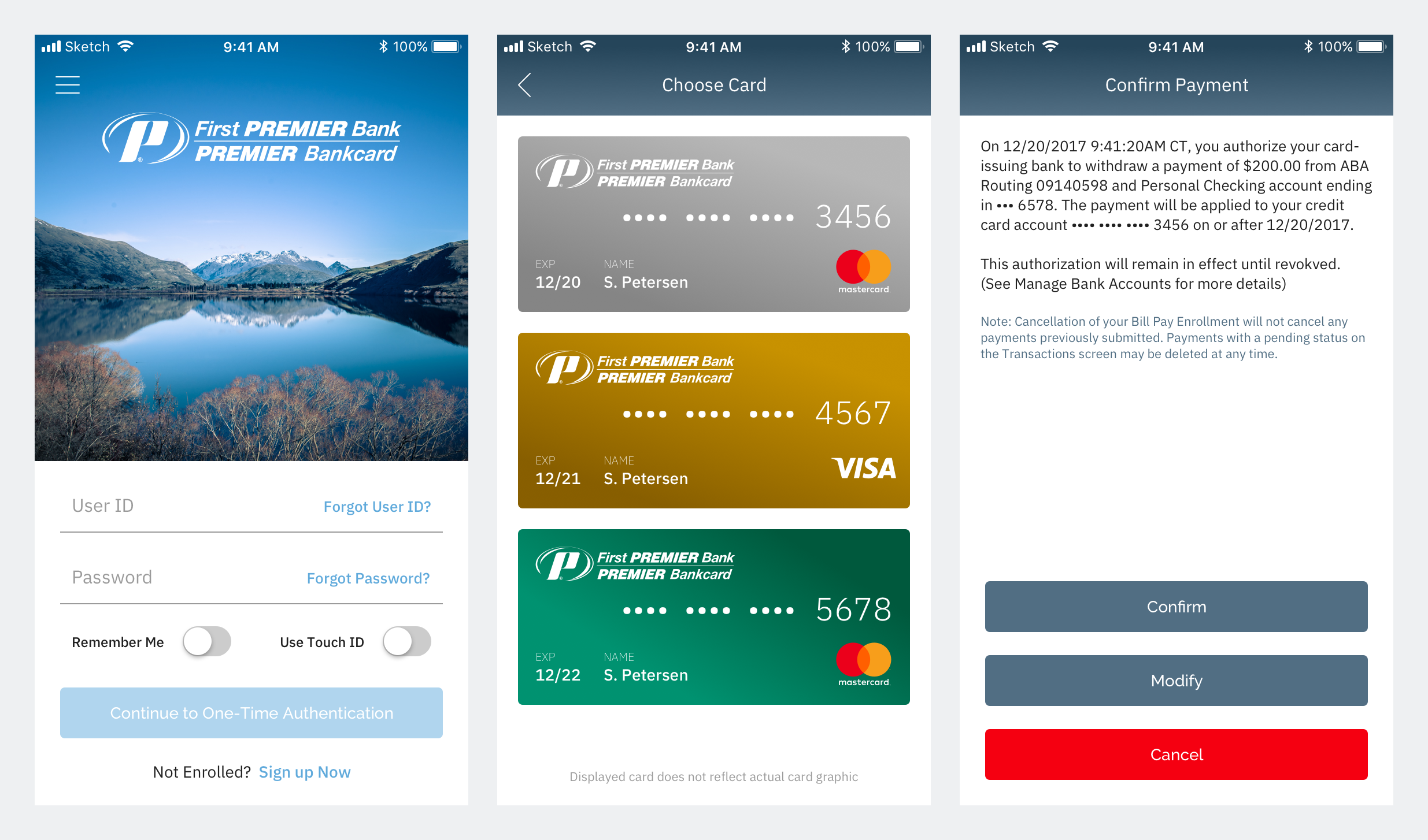
The finished screens are not green. By March 2018 the header and buttons had moved to the slate blue from the mood board, with green kept for links and for the card artwork itself. The launch icon went through the same argument in the open: rounds dated May 29 to August 14, 2018 try green, white, slate and deep green versions of a card with the PREMIER mark.
Accessibility as a line item, not an afterthought. Our proposal carried its own user story for screen readers and native accessibility features: go through each part of the website and decide which accessibility descriptions each view, header, button and input needs. The bank's Accessibility Notice is a first-class screen under Legal, not a link out.
Solution
Paying the bill. The website's payment form became four decisions on one screen: pay to, pay from, date, amount. Date and amount each open a set of large tiles with the sensible defaults first (earliest payment date or due date; current balance or minimum due), and the posting-time rules stay on the screen where the decision is made.
Getting in, and getting back in. Sign-in leads to one-time authentication by text, call or email, then Touch ID. The lock-out state says why in plain words, "For your safety, we have temporarily restricted your account," and recovery asks for the same two identifiers Enroll does.
When the data is slow or missing. Loading placeholders and failure states were designed for the account screens, so a slow response shows a skeleton and "Could not load data. Tap here to try again" and not a blank page.
Android as Android. The Android file is its own set of 133 screens with the platform's status bar, type sizes and keypad, not the iOS artwork resized.
Results
The app shipped. What the archive documents is the design and the hand-off: it holds finished screens for both platforms through September 20, 2018, developer folders with Raleway font files, PNG exports and slices for iOS and Android, final launch icons at every iOS size dated August 16, 2018, and a push certificate kit dated September 26, 2018, which is evidence of release preparation, not a launch date. Rocksauce listed First Premier Bank under fintech on its own projects page.
What I'd do differently
I would test with cardholders. We reviewed seven competitor apps carefully, and the team's own reaction ("our team responded well to financial apps with a personal touch") stood in for the people who actually hold these cards. Five sessions with the wireframe in January 2018 would have cost a week and told us whether tiles for date and amount were clearer than a form.