- Role
- Copywriter, Principal Designer, Researcher
- Year
- 2021
- Client
- Agency, Enterprise
- Industry
- Product Building, Software Design & Development
- Team
- Skills
EXSquared Branding & Design
Rebranding one of Austin's most trusted development companies
The Roots
Branding a product company is never an easy job. Everything a consumer looks at is a commercial. A testament to the company's skills. EXSquared was a brand that needed an updating. Luckily, they had purchased my design agency - Rocksauce.
Biggest issue? No one knew how to say the name. EX2 or EXSquared? The latter is correct. Since design is communication, understanding the company name was at the top of the list. Design sometimes needs to find a jumping-off point. When one doesn't exist, time to create it.
Hip to be Square
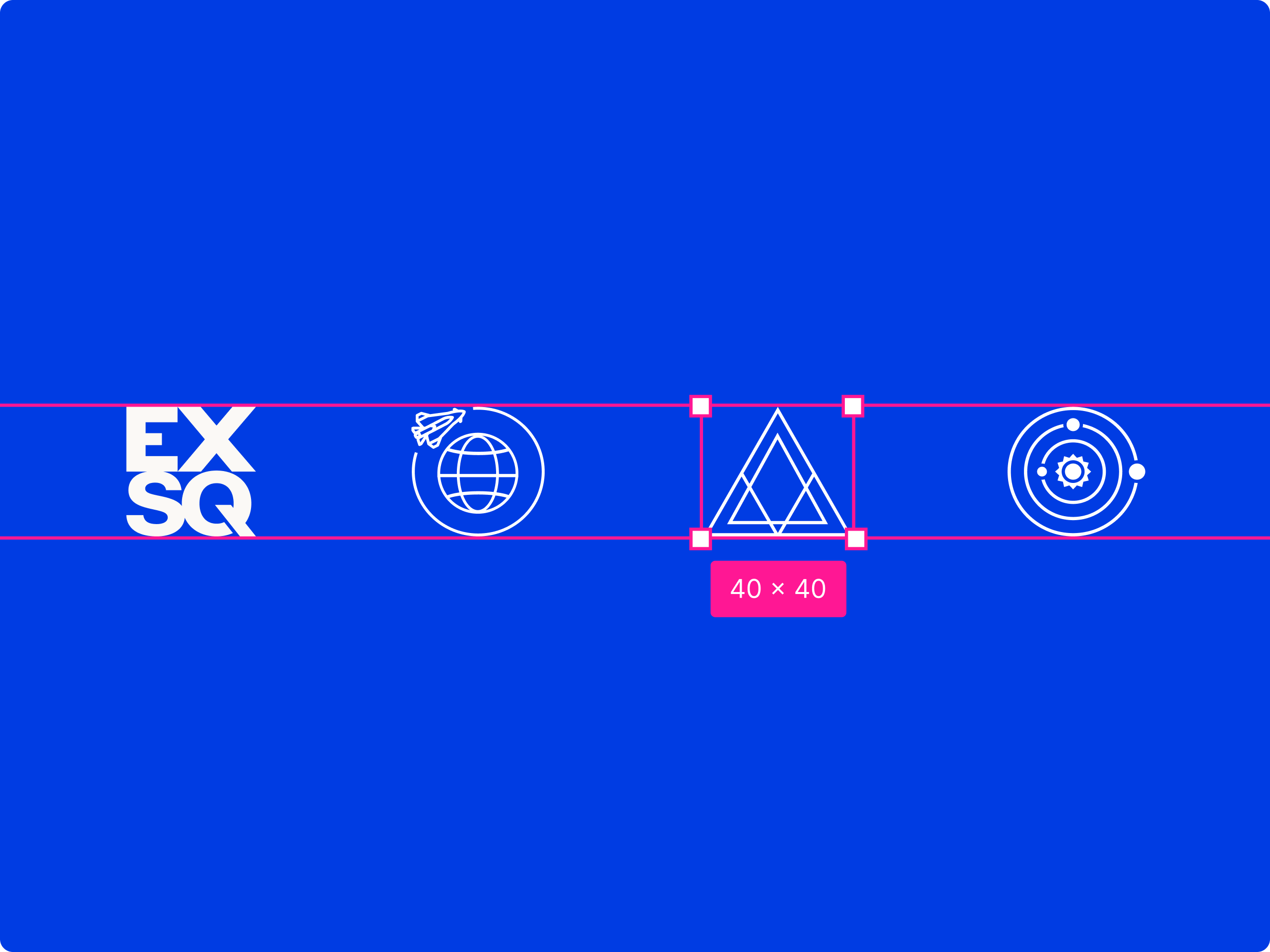
Brands need strong marks that can be used in tight spaces. Favicon, social media avatar, or even on a t-shirt pocket. Something that could also be memorable when someone sees it. To own the brand's name in a viewer's mind, even when the letters are nowhere to be seen. I thought about updating the original logo's symbol, but it didn't have any meaning to the brand. It was also awkwardly sized and illegible at small resolutions.
Lindon Leader immediately came to mind - the genius behind the FedEx logo's arrow. Many designers have been inspired by the simple hidden arrow since it's unveiling in 1994, but most miss the double-meaning of the arrow. Forward movement, delivery, arriving on time, and all the rest of the brand principals that were synonymous with the Federal Express.
But, EXSquared's arrow was actually a house. Why? Because many of their customers came from the New Home Industry. Their parent company, Builder Homesite, Inc., was the the largest marketing agency in Austin, but solely focused on homebuilders. Making their direct connection to homebuilding a core aspect of the EXSquared mark.
Color Drives Engagement
My approach to color is strategic, aiming for immediate brand recognition and lasting impact. For EXSquared, I integrated their vibrant brand palette with a sophisticated off-white to create a memorable visual identity for their Fortune 50 clientele.
Within EXSquared's design system, I meticulously blended hues, employing specific percentages and blending modes to establish a cohesive and accessible visual language. Each shade was chosen to enhance depth and ensure the brand captivates across all mediums, making EXSquared consistently unforgettable. Dark and light shades use percentages & multiply to ensure they work on their backgrounds.
From the reliable depth of True Blue to the vibrant energy of Tangerine and Sunshine Yellow, I leverage color to evoke emotion and guide user attention. The sophisticated charm of Royal Violet and the refreshing vitality of Verdant Green add layers of meaning and brand personality. My approach extends to the nuanced tones of Dream Blue and the bold statement of Pure Red, each selected for maximum impact.
For EXSquared's typographic backbone, I selected Helvetica Neue as the primary voice. Its clean lines and unparalleled readability ensure a seamless user experience across all content, from body copy to interactive elements. To punctuate key moments, I introduced Harfang, a striking secondary font. This distinctive typeface adds a touch of personality and emphasis, reserved for impactful introductions and conceptual headers.
Helvetica Neue, a linchpin of modern design, offers a robust and versatile foundation, ensuring clarity and professionalism. It's a classic for a reason. Harfang, meanwhile, is a playful yet sophisticated choice from the Adobe Fonts library, meticulously employed to draw attention without overwhelming the user.
Homepage
The new EXSquared site needed to be an experience, not a brochure. Movement engages users, directing their actions and capturing attention. Each motion of the page drives the eye down the screen, ingesting new content as it goes along. Don’t stuff everything above the fold, define what people need to know . A powerful video sets the tone and sparks ideation, exactly what EXSquared wanted people to walk away with.
Motion was where I had the most fun. Every scroll reveals something new: headlines that slide in with intent, stats that animate into place, case studies that feel like chapters in a story. The animations are light but purposeful, giving the site energy without weighing it down.
Case studies got their own stage. As great clients should: Coca-Cola, Lennar Homes, Don’t Mess with Texas, each one stands apart with bold photography, color, and layout. Instead of cramming them in a grid, I let them breathe. Scrolling feels like flipping through a series of spreads, each designed to spark curiosity for what’s next.
The credibility section needed to hit fast and clean. Big numbers, sharp logos, and no wasted words. 20 years in business, 14 Fortune 500 clients, millions of users, all presented in a way that reinforces trust without slowing the flow. Visitors get proof of EXSquared’s impact in seconds.
Under the hood, the site is as smooth as it looks. Responsive layouts, light animations, and intuitive navigation keep the experience consistent on any device. It’s built to feel effortless — modern, fast, and always moving forward. Exactly the type of site I love building.
Careers
The Careers landing page is where the experience starts, so I designed it to feel like a brand pitch, not just a job board. The hero headline — “Join the experience” — sets the tone right away: EXSquared isn’t looking for employees, they’re inviting people into a culture. Bright, color-coded department blocks make the categories fun and scannable, while perks and benefits are built right into the page so candidates don’t have to hunt for them.
By the time you’ve scrolled once, you know what EXSquared does, how they treat their people, and where you might fit in.
From there, the category archive pages take over, filtering roles into specific tracks like Design, Development, or Marketing. This structure makes the experience feel organized and relevant: if you’re a designer, you’re instantly dropped into a page that only shows design jobs, complete with industry-appropriate imagery and a persistent application form right on the sidebar. A curated space that speaks directly to your career path and invites you to take the next step.
The individual job posting pages are where everything comes together. Instead of drowning people in generic HR copy, I structured each posting like a story: “What you’ll do,” “What you’ll bring,” and “What you’ll get.” It’s simple, human, and easy to skim, while still giving enough detail for serious candidates. The design reinforces clarity with bold sectioning, photography that feels authentic, and benefits repeated again at the bottom so you never lose sight of the bigger picture.
Together, these three pages form a smooth funnel: brand pitch, category filter, detailed posting. Each one building on the last. Candidates never feel lost, and there are no dead ends: if one role isn’t a fit, related jobs are right there at the bottom. A recruiting flow that feels more like a conversation than an application process, and that was exactly the point.
Capabilities
The Capabilities section is where the EXSquared brand really flexes. Instead of a laundry list of services, I designed it to feel like a launchpad. Four bold pillars that instantly show off the company’s range: Big Bang Ideation, Experience Design & Development, Sitecore & Digital Experience Platforms, and Nearshore Remote Talent & Staffing. Each card is direct, eye-catching, and designed to make you want to click in and see more.
Once you dive in, every page feels like its own story. Big Bang Ideation captures the buzz of collaboration, sticky notes and all. Experience Design & Development comes in strong with confident statements about performance and craft. Sitecore speaks with authority, leaning into EXSquared’s decade-plus of platform expertise. Nearshore Talent flips the script, highlighting the people behind the work and the efficiency they bring. Each one has a distinct personality, but together they create a bigger picture: EXSquared can handle the whole digital journey.
The pages all follow the same rhythm: a bold claim up top, visuals that bring it to life, and real case studies that prove the point. Bechtel, Coca-Cola, Lennar, CallMiner , the credibility is baked in. It’s not abstract promises; it’s “here’s how we’ve done it before, and here’s how we can do it for you.” That balance of storytelling and proof makes the content both inspiring and trustworthy.
To keep momentum, I built in cross-promotion across the section. Each page ends with the full set of four capabilities, so visitors never hit a dead end. It feels like an ecosystem — no matter where you start, you’re nudged to explore further, and by the time you’ve clicked around, you’ve seen how all the parts fit together. It’s clean, confident, and designed to leave the impression that EXSquared can do it all.
Work
The Work section was designed to feel like a showcase, not just a list. The main page opens with bold, high-impact client tiles, Bechtel, Coca-Cola, Lennar Homes, Don’t Mess With Texas. Instead of burying everything in a flat portfolio grid, I let each brand own its space with a strong block of color, photography, and a clear “View Case Study” button. It’s simple, visual, and immediately communicates the scale of clients EXSquared works with.
When you click through, the case study templates carry the same energy while dialing up the storytelling. Each brand gets its own identity through color, so the template is flexible enough to adapt to any palette or corporate color scheme. That consistency creates a system, while the color blocking makes every case study feel distinct and on-brand. The overall effect is that scrolling through the Work section feels like flipping through a series of magazine features.
Inside the case studies, the content is broken down into digestible chunks: Project Summary, The Strategy, and Proven Results. Photography is layered throughout to keep things human and real, while bold headlines anchor the storytelling. This structure makes it easy for users to skim, but still compelling for anyone who wants the full details. By combining narrative and proof points, each case study becomes both a brand story and a credibility piece.
Together, the Work pages position EXSquared as both creative and trustworthy. The design system ensures every client feels like the hero of their own story, while the consistency builds confidence in the agency itself. Whether it’s Coca-Cola in bold red or Lennar in deep blue, the pages adapt to highlight the brand while still reinforcing EXSquared’s personality. It’s clean, confident, and built to impress, with engaging hover transitions that expand on interaction.
Blog & Company
The Blog was designed to be more than a dumping ground for posts, it’s a thought leadership hub. The archive page uses large, bold visuals with strong headlines, making it easy to browse by topic or dive into a story that grabs your attention. A sidebar keeps everything organized with quick topic filters and a consultation form, so users are always just a click away from reaching out. The design makes content feel approachable and structured instead of overwhelming.
On individual article pages, I focused on readability and authority. Pull quotes and subheads break up the text, large imagery keeps the page engaging, and author bylines bring a human voice to the writing. Related articles are built right in at the bottom, keeping users engaged and encouraging exploration. It’s a system that balances credibility with usability: serious content, but presented in a way that’s easy to digest. For EXSquared, that positions them not just as a vendor, but as a leader in digital thinking.
For Company, I wanted to strip away the usual corporate fluff. The About page leads with bold, honest messaging: “Let’s be clear.” Instead of trying to oversell, it acknowledges that plenty of agencies claim to do digital: the difference is in how EXSquared approaches the work. I broke the content into digestible values, mission, vision, stats sections, so visitors can quickly see what EXSquared stands for and what kind of impact they’ve had. It’s clean, confident, and rooted in credibility.
The Contact page carries that same energy but makes the act of reaching out feel effortless and a little fun. The bold blue hero panel grabs attention immediately, while the form is quick and human-centered. To make it memorable, I included playful touches like “By Jetpack” directions alongside the practical contact info and world map. It shows that EXSquared is global, approachable, and not afraid to inject personality into even the smallest details. Together, the About and Contact pages create a strong brand bookend.
Results
All the hard work paid off. All of the numbers we were tracking went up, across the board, with no ground lost. Most important, people were coming back to the site more, staying on it longer, and we increased our qualified inbound leads.